
Photographer: Keith “Keef” Macmillan
Location: Mapledurham Watermill, Oxfordshire, England
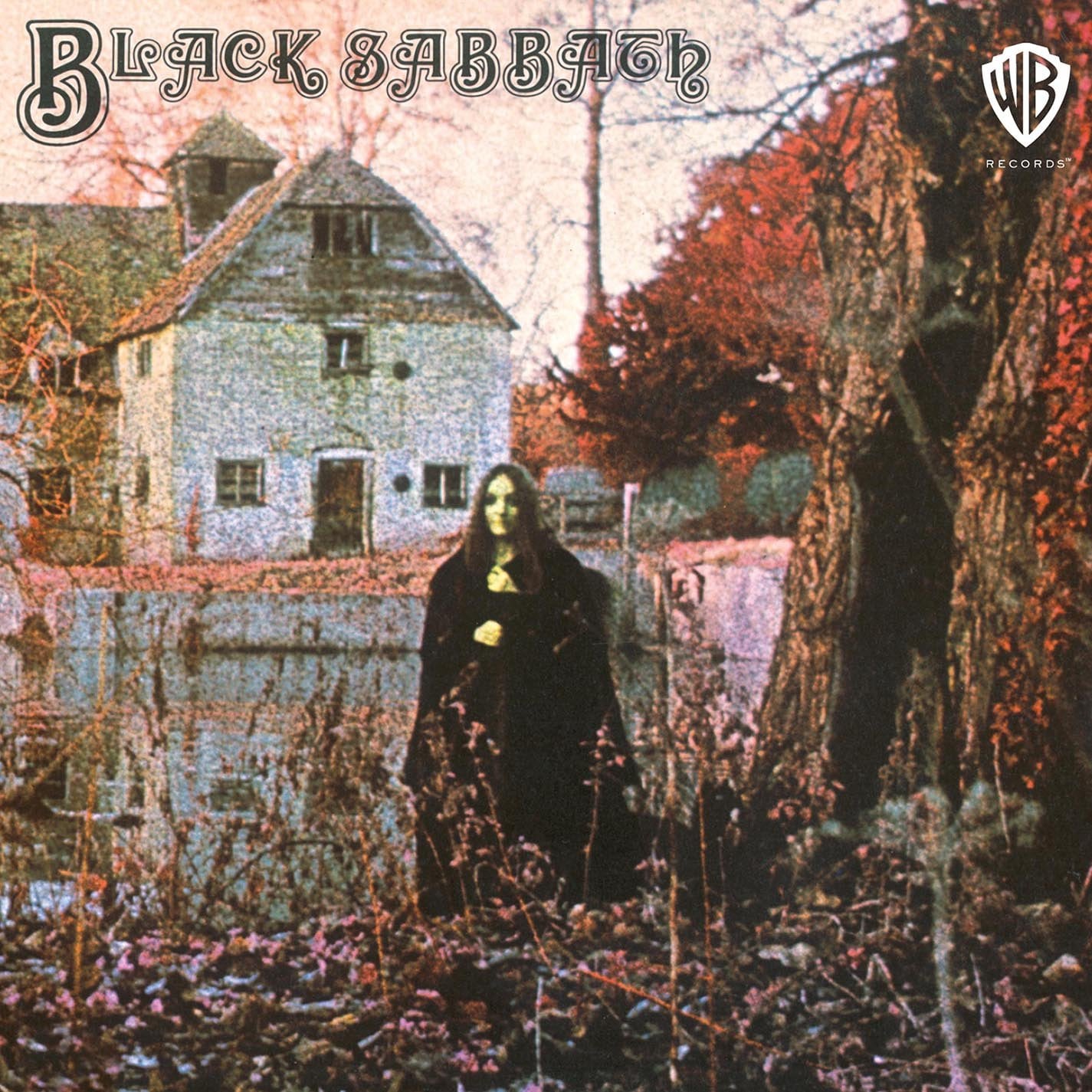
When Black Sabbath unleashed their self-titled debut on Friday the 13th, February 1970, it wasn’t just the music that sent chills through an unsuspecting world — it was the imagery. That eerie woman in black, standing still among the autumnal fog outside a centuries-old English mill, became one of the most haunting and iconic images in rock history.
A New Sound Demanded a New Look
Black Sabbath’s music was unlike anything the rock scene had heard — slow, heavy, and steeped in dread, it twisted the psychedelia of the late ‘60s into something menacing and primal. The band wanted the cover to match that intensity, not with flames or skulls, but with something more subtle and sinister.
That’s where Keef (Keith Macmillan) came in. A photographer and art director for Vertigo Records, Keef had a reputation for the surreal and mysterious — a perfect fit for Sabbath’s doom-laden debut.
The Location: Mapledurham Watermill
The photo was taken at Mapledurham Watermill, a centuries-old mill near Reading, England. With its 15th-centurystructure, mossy stone walls, and forested surroundings, the location oozed rustic Gothic charm.
The shoot took place early in the morning, allowing for low natural light and a dense, misty atmosphere. To heighten the effect, smoke machines were used to give the setting an ethereal, almost dreamlike quality. The result was a scene that looked less like a photo and more like a still from a haunted film.

The Mysterious Woman
For decades, fans speculated about the identity of the figure at the center of the image. Shrouded in black, with an expressionless stare and barely visible hands, she seemed more apparition than human. Rumors swirled: Was she a real witch? A ghost? A clever double exposure?
Eventually, she was identified as Louisa Livingstone, a model and performance artist who worked on several projects in the early ’70s. Keef directed her to stand still and unnerving, her face painted to appear deathly pale, her form cloaked to evoke classic depictions of witches or spirits.
To this day, the effect is uncanny — you can stare at her for minutes and still not be sure if she’s really there.
The Photography: Infrared Sorcery
Keef used infrared film to create the image’s haunting tone. This technique altered how foliage, sky, and skin tones reacted to light, giving everything a slightly unnatural sheen. Trees look ghostly, water ripples with an oil-slick glimmer, and the sky becomes a blank, oppressive canvas.
It’s not just the subject matter that makes this cover terrifying — it’s the way the camera bends reality, making even nature look like it’s under a spell.
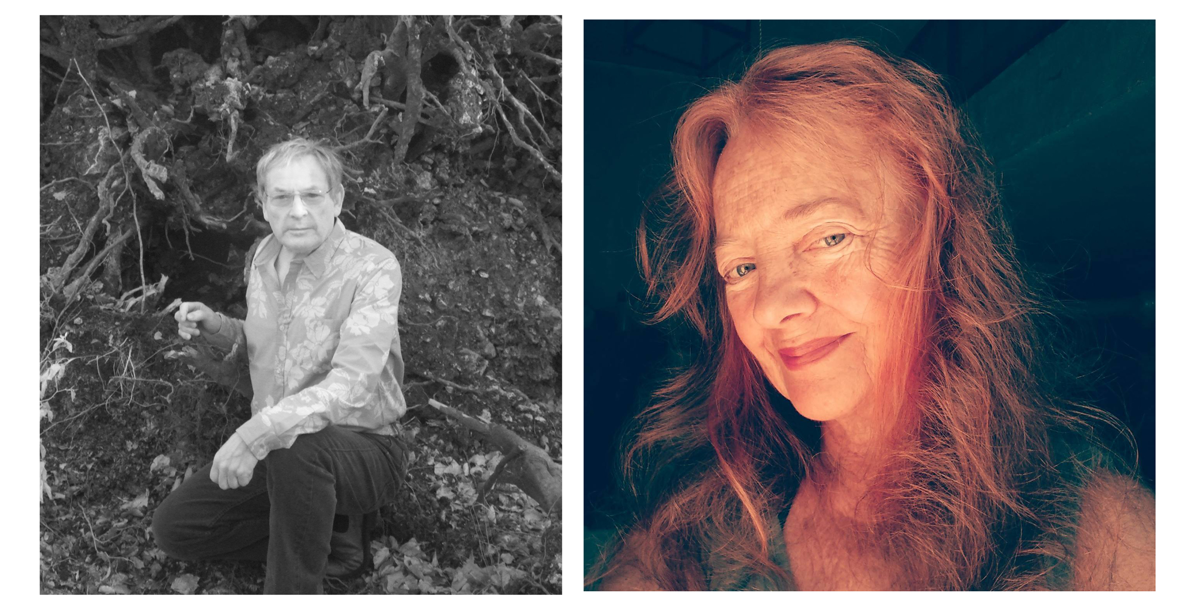
Keith Macmillan and Louisa Livingstone today. Courtesy of Freya Macmillan, Courtesy of Louisa Livingstone
Aesthetic Intent: Fear as Art
In interviews, Ozzy Osbourne and the band made it clear: this wasn’t shock for shock’s sake. They wanted to scare people. The music — filled with tritones, apocalyptic lyrics, and looming riffs — was a sonic response to the chaos of the Vietnam era and post-‘60s disillusionment.
The artwork, with its subtle menace, echoed this perfectly. It didn’t need blood or fire. It simply planted a seed of unease — and let the listener’s imagination do the rest.
The Vertigo Swirl & Gothic Typography
The UK pressing featured the now-legendary Vertigo “swirl” label on the vinyl — a hypnotic black-and-white design that added to the overall sense of disorientation. The band name was printed in bold, Gothic type — no album title, no band photo, no smiles. Just the image, and the name: Black Sabbath.
It was a statement of intent, stark and unforgettable.
The Legacy of the Witch
The cover art for Black Sabbath has been endlessly analyzed, parodied, and reimagined over the years. It set the tone not only for the band’s aesthetic but for the entire genre of heavy metal. It taught bands that imagery mattered — that a single image could conjure as much dread as a hundred riffs.
More than 50 years later, the woman in the mist still stares from the cover, her meaning still unclear, her presence still chilling. She is rock’s first true specter, a visual gateway into the darkness that Sabbath so effectively defined.
“I love the front cover,” Black Sabbath’s drummer, Bill Ward, says. “I thought it was mysterious. It’s kind of like where we kind of hung our hats, to be honest with you. All that was fantastic to me. I hated when I opened up the middle part and somebody put an upside-down cross in it. I hated that because that wasn’t who we were. And nobody had talked to the band about that.… I think that they wanted a certain image, or they wanted it to be a certain way. I don’t know what they thought. But it gave us an image that we fought in the press over for maybe four or five years.”
“When I saw the cover, I thought it was quite interesting, but I thought, ‘Well, that could be anybody,’ so it’s not like I got any kind of ego buzz out of it,” Livingstone says. “But, yeah, I thought it was a very nice cover.”
Sometime after the album’s release, a woman came to one of Black Sabbath’s concerts and attempted to impress them by saying she was the cover model. “We didn’t know who she was,” Iommi says. “She said, ‘I was the girl on the front cover.’ ‘Oh, right.’ But I don’t remember what she said.”